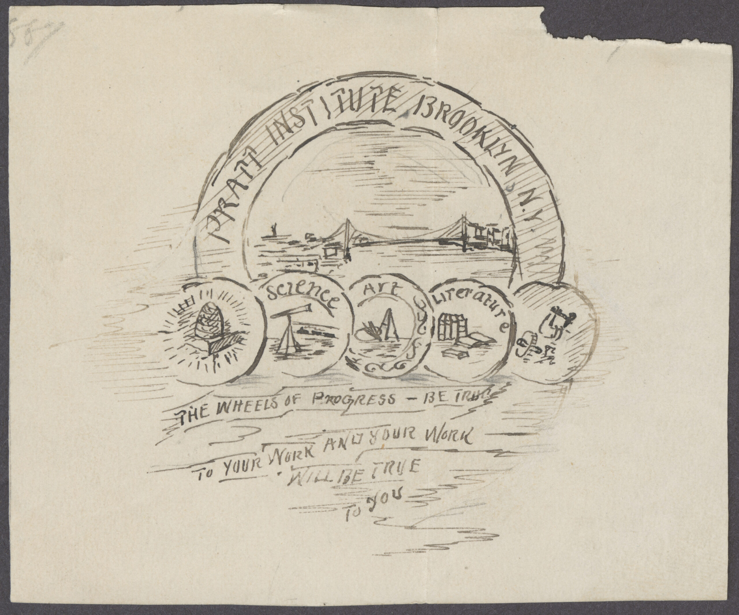
The brief: “A simple design which would cover the general features of the Institute,” with emblems to highlight the new institution’s educational ambitions in the areas of literature, science, art, labor, and skill. In 1887, Pratt Institute founder Charles Pratt outlined his wishes for an institutional seal in a letter to Walter Scott Perry, the first director of the School of Fine and Applied Arts, initiating a design collaboration.
Perry’s interpretation, early sketches of which appear here, would present the breadth of Pratt’s disciplines under a symbolic Brooklyn Bridge, as he described in a recollection of the seal’s history, located among his papers in the Pratt Institute Archives: “This seal was designed with circles holding symbols of art, literature, science, labor and skill and industry. The Brooklyn Bridge was included in the design as an illustration of one of the world’s great achievements in scientific and perfected technical and labor construction, and also for another reason. It was believed that the time would come when the bridge might be symbolic of the far reaching influence of Pratt Institute, stretching out from Brooklyn to Manhattan, and beyond (as a connecting influence) to all parts of the country.”
While the design has had enduring power, it has not been without critique.
Earlier this year, Prattfolio visited Pratt Archives, where Cristina Fontánez Rodríguez, Virginia Thoren and Institute Archivist at Pratt Institute Libraries, guided us through objects and materials from the Memorabilia Collection, a trove for anyone interested in Pratt history, especially how Pratt’s mark has been used to generate connection and affiliation over the years, with jewelry, garments, flags, ephemera, and more sporting iterations on the Institute logo.
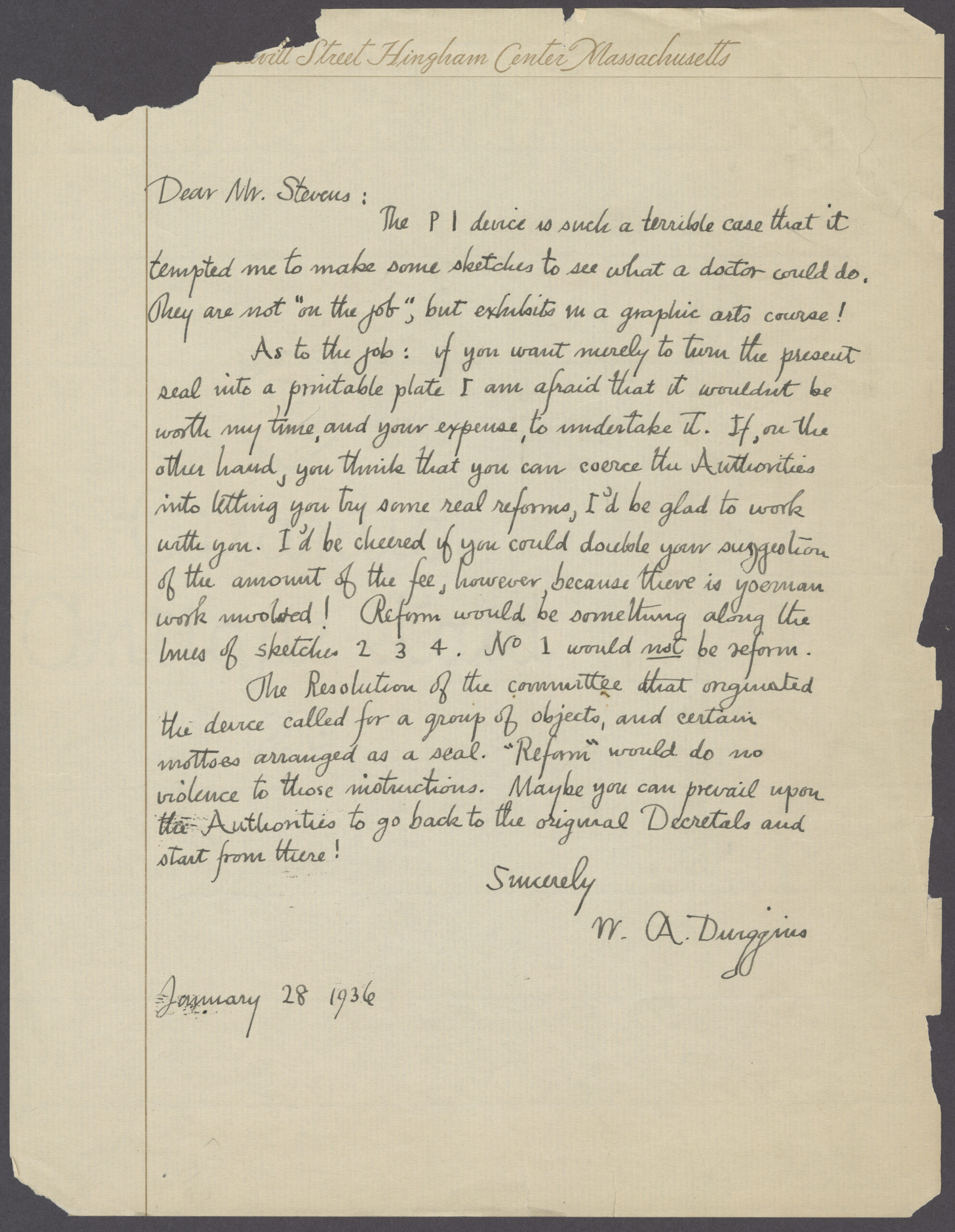
Because of our curiosity around the logo—especially on the heels of the visual identity refresh recently undertaken by Pratt Creative Services—Fontánez Rodríguez also shared records from the Charles Pratt Papers related to Pratt’s seal. Not only were there the original sketches of the seal but pages of critical appraisal, notably from graphic design heavyweight W. A. Dwiggins, who was called upon in the 1930s to design a bookplate using the seal.
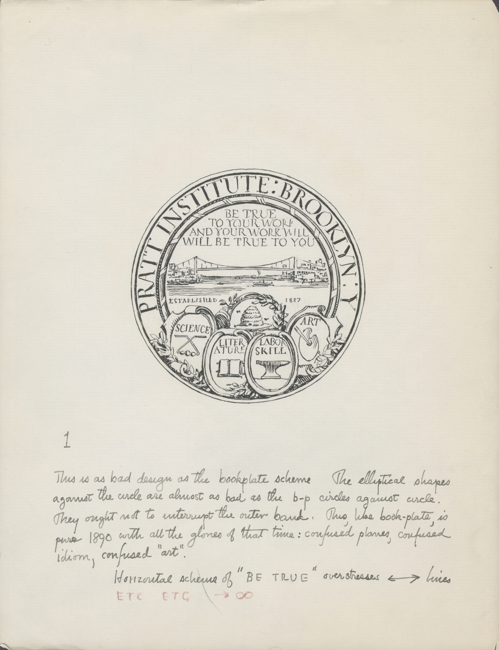
Dwiggins would only consider the bookplate commission if he could overhaul the seal, and even took it upon himself to present several annotated iterations.
“The PI device is such a terrible case that it tempted me to make some sketches to see what a doctor could do. They are not ‘on the job,’ but exhibits in a graphic arts course!” Dwiggins wrote in a 1936 letter to then Pratt Library Director Edward Stevens. He called for diving back into the first intentions for the seal: “The Resolution of the committee that originated the device called for a group of objects and certain mottoes arranged as a seal. ‘Reform’ would do no violence to those instructions. Maybe you can prevail upon the Authorities to go back to the original Decretals and start from there!”
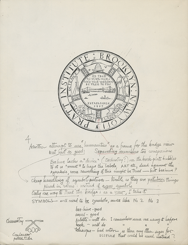
Dwiggins’s criticism was just the beginning.
It turned out that at the time of our Archives visit, Electronic Resources Librarian Matt Garklavs was writing a post for the Pratt Libraries blog, Iron and Glass, about the seal in the context of ex libris, or bookplates. The Pratt Institute Library’s first bookplate, made in the 1890s, featured Pratt’s seal as its centerpiece, and this led Garklavs down the path of the seal’s curious history.
“I assumed a school like Pratt would make for an interesting case study on this niche little part of library branding,” Garklavs writes in the post, published in March, referring to ex libris. “Instead what I found was a series of unsuccessful, but admirable attempts to reinvent a small part of the Institute’s identity.”
Along with Dwiggins’s feedback on the seal, Garklavs highlights that of alumna Sandra Brannon, MS Communications Design ’84, who made the case for a redesign in her master’s thesis. Brannon’s proposals and critical argument, Garklavs says, could inform future design endeavors: “The seal designed in the Victorian era has contradictory styles and aesthetic confusion–characteristics of that period. It is complicated, unfocused, hard to remember and difficult to reproduce or utilize conveniently,” Brannon wrote. “Visually speaking, the absence of a strong theme in Pratt’s seal is a problem. Without a central image of focus in the seal, the viewer gets the impression of a complex set of disparate elements.”
Meanwhile, Pratt’s Director of Creative Services David Frisco recalls when, in 1996, graphic designer and alumnus Paul Rand received an honorary degree from Pratt adorned with the seal, Rand found it so offensive he set about designing a new one on his own time. Rand even gave the assignment to students he taught in a program that summer in Switzerland, including Frisco, who himself then made a go at a redesign.
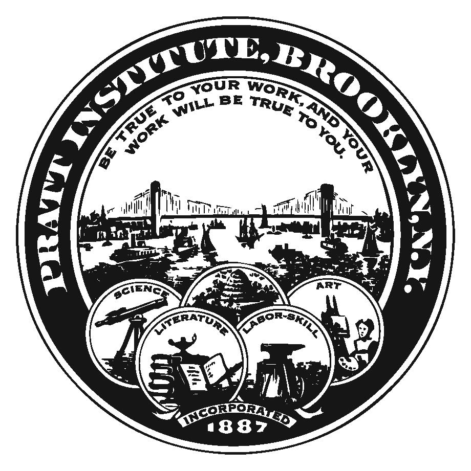
Despite these critical reappraisals, Perry’s original design remains in use today.
While the seal’s formal qualities have sparked critique across generations, its heritage, and its ability to endure, may be part of its charm. Where could its origins, combined with Pratt’s iterative spirit, take the seal in the future?