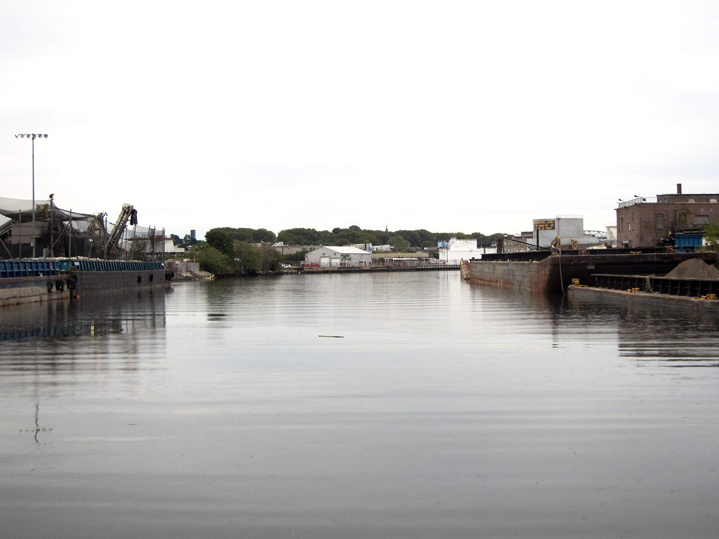
Looking at the glittering condos along the Williamsburg waterfront, it’s hard to imagine that North Brooklyn was once a hotbed of factories and manufacturing including polluting industries like oil refineries and shipbuilding. Those factories propelled New York’s economy, but they also released environmentally toxic chemicals that linger in the same areas where residential development is spreading.

Looking at the glittering condos along the Williamsburg waterfront, it’s hard to imagine that North Brooklyn was once a hotbed of factories and manufacturing including polluting industries like oil refineries and shipbuilding. Those factories propelled New York’s economy, but they also released environmentally toxic chemicals that linger in the same areas where residential development is spreading.
Two years ago, North Brooklyn Neighbors (NBN), a nonprofit organization that advocates for environmental and climate justice in Williamsburg and Greenpoint, wanted to create a resource to help residents understand that industrial history, learn about environmental concerns, and use that information to advocate for cleanup. They needed a partner with experience mapping complex data in an accessible and engaging format. Pratt Institute’s Spatial Analysis and Visualization Initiative (SAVI) was a natural fit and the result of their collaboration is the Environmental Legacy and Improvements (ELI) project, which includes the North Brooklyn Toxicity Map.
Can Sucuoğlu, interim director of SAVI, explained that the map is a perfect match of NBN’s extensive historical knowledge and SAVI’s goal of “putting data into context,” making complicated data accessible to the public.
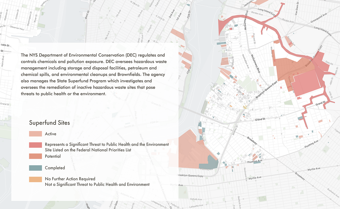
An overview of toxic sites on the North Brooklyn Toxicity Map

The map is both a storytelling and environmental advocacy tool. It offers a way for viewers to learn about the current and former industrial sites of North Brooklyn through narratives of the social, economic, and environmental history of the area. That information can then be used as the basis for collective action with their neighbors. Users can either search for a specific address or click on different sites on the map to learn about contamination and environmental designations in the surrounding area.
Information on environmental contamination is often in complex databases scattered across various agencies. SAVI helped combine all of that data into one place and explain it in layperson’s terms, saving time and frustration for residents who might want a simple way to answer important questions on their local environment, such as whether their child’s school is near a Superfund site.
Superfund sites on the North Brooklyn Toxicity Map
As viewers scroll through the maps, they can read an accompanying history running along the left side of the page, detailing North Brooklyn’s transformation from an agricultural to an industrial neighborhood, and more recently from an industrial neighborhood to a residential one, as well as the arrival of immigrants, artists, and gentrification.
Sucuoğlu believes the storytelling component helps set the map apart from similar projects. Adding stories, he said, “ensures that none of the data is without context. We’re not just throwing people raw data, but explaining more about why things are as they are.”
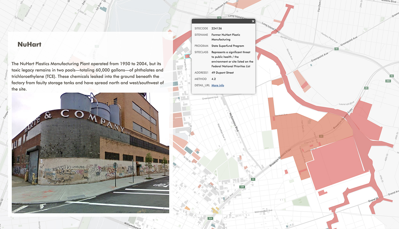
On the advocacy front, by visualizing data in a way anyone can understand, Sucuoğlu hopes viewers will use the information to work collectively and take action to pursue environmental cleanups. Once a person understands their local environmental issues, they might be encouraged to get involved with NBN and their ongoing work to get lead out of Greenpoint’s soil, clean up Superfund sites like the former NuHart Plastics factory, and advocate for more parks and other greenspaces.
Anna Yie, MS Sustainable Environmental Systems ’20, who worked on the map, echoed Sucuoğlu’s perspective on its potential for collective action. “I think it is a community tool,” Yie said, “made for people in the neighborhood who want to understand more about where they live and why the environmental issues that are present today exist.”
The map was released at the height of New York’s COVID-19 outbreak in the spring of 2020. At their launch event on Zoom, around 40 people from multiple organizations across Brooklyn joined for the celebration and introductory webinar.
“It was really cool to see the project evolve from our initial brainstorming meetings into the finished product,” Yie said. “My favorite part was working with NBN and SAVI—everyone was so positive and dedicated and I got to learn so much from the process.”
SAVI and NBN are continuing to work together to keep the ELI project and North Brooklyn Toxicity Map up-to-date as available information and advocacy efforts continue to develop. Sucuoğlu believes that this initiative “will help shape the future of SAVI” in the kinds of projects they work on, the organizations they collaborate with, and how they push the boundaries of data visualization for social impact.
Explore the North Brooklyn Toxicity Map on the Environmental Legacy and Improvements (ELI) site.